
The Color Wheel of Life
When looking at a garment, the first thing most people notice is the color. Right off the bat, before touching the fabric or noticing how it's made, people see the color. Color has the power to really shape emotions, whether subconscious or not. It can communicate a message all its own about the person wearing the outfit without a word ever being spoken. As apparel designers, merchandisers, or just fashion lovers, understanding the psychology of color is just as important as all of the other knowledge we consume about our products.
The basic level of understanding color psychology is to examine how different colors affect behavior. While some individuals have a background associated with a particular color, most people share a common experience. Associations like this can help artists make the viewer and wearer feel certain emotions and can give a brand an identity.
One of the most powerful colors in fashion is the color red. We often view it as a sign of confidence or strength. It stands out and causes people to look. It's often used as a statement piece that is meant to attract attention. We think of evening gowns and lipstick. Red is meant to make an impression. The Marilyn Vance dress worn by the beautiful Julia Roberts in Pretty Woman is perhaps the most iconic case. It is a showstopping example of wealth, romance, and transformation.
However, blue is a calmer color. Usually a safer option or linked to trustworthiness. Often it is included in a neutral color palette alongside browns, whites, and blacks. Blue is the most common color we see people wear alongside black. It is also the favorite color of most people when asked. The durable and reliable nature of blue jeans is a large contributor to how we see the color in clothing. Blue jeans are one of the most versatile articles of clothing produced. You can dress them up or down. It's a good bet that if you checked everyone’s closets, there would probably be a pair of jeans. Blue is an approachable type of confidence, one where people are perceived as peaceful or timeless.
Yellow is optimistic. Most people agree that yellow represents happiness and energy. Due to its bright hues, it is very easy to overdo the color or clash with other articles. Designers typically work very strategically to spread yellow out throughout a collection rather than to make it a core aspect. A small accent of yellow can easily brighten an outfit without drawing too much attention. The exact shade, however, can really alter the look without meaning too much. Darker shades of yellow are usually perceived as more elegant and adult than lighter shades.
Sustainability is a large aspect of the current fashion design world. The color green is often seen as a symbolic color. It represents nature and growth, and that can link our brains to environmental awareness. Green is a very organic color that makes us feel calm and balanced. It can also be alongside yellow for a cheerful increase. Both colors have shades that can trigger a childish feeling and make someone feel happy just seeing them. It can also feel luxurious and wealthy when you imagine emerald and deep greens. This color can tend to be more personal to people, and the reactions to it vary the most, even using the same shades.
The most common color of them all is black. It is iconic in the fashion industry. You might’ve heard the saying that another color is the “new black”. Truthfully, nothing is replacing such a versatile color. Coco Chanel’s “little black dress” is a prime example of the color being timeless. Whether it's elegance or mystery, black is your go-to. It emphasizes silhouettes because when you take away brighter colors, you can see the form with more distinction. Many actors or models, when auditioning, wear all black to limit distractions and bring focus. In collections that rely heavily on concepts, black is used so the viewer has a better understanding of the construction put into it.
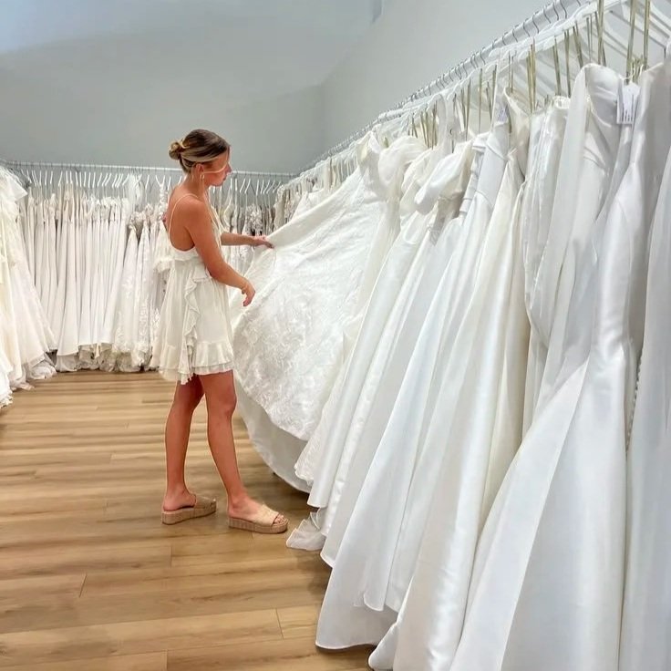
White is purity, in its simplest form. When we think of white, we think of wedding dresses and cleanliness. It adds a refinement to it. Construction dictates more if we view the color as modern or timeless, but in both instances it has a similar effect. White adds a contrast in fashion design, whether it's lace or embroidery. The color is delicate, which is linked to how we view the color. You would not wear a white shirt if you are going to eat something messy. That’s a prime fashion rule, right behind the socks with sandals one. Someone is usually confident enough in their circumstances to wear white.
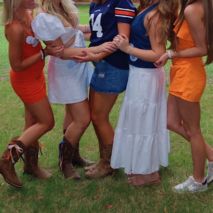
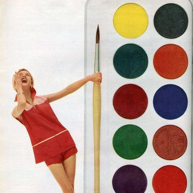
Color combinations are also very important. In the world of color theory, there are three main types of color groups. Monochromatic means one color. Imagine an outfit comprised of simply different shades of red. This is a unified look. It relies more on a silhouette and texture differences than dramatic color variations. The next is complementary colors. When you look at a color wheel, it is the color that sits directly opposite another color. Yellow and purple, red and green, and Auburn’s favorite: blue and orange. Think Christmas too. These pairings give visuals energy. This is the most common use of color combinations, especially when you want to stand out. The last main color combination is analogous. If you pick a color on the color wheel, this combination includes the colors on either side of that original color. It's much more cohesive and ultimately pleasing to the eye.
The cultural context provides an entirely different view on color psychology. Even though some associations are somewhat universal, they can also have incredibly altered perceptions. White is most commonly seen as a color used in weddings and to symbolize purity in Western culture. However, in Eastern Asian cultures, it is often a sign of mourning. This is the exact opposite color that other countries view as mourning. Red can be a symbol of war, a symbol of celebration, a symbol of authority, or even a symbol of love depending on the location of the wearer. Industries that work on a global scale have to understand cultural differences in color association to make sure their product is being received the way that it's intended.
Color is one of the most powerful tools to tell a story. It often creates first impressions and can influence people’s judgments about the people associated with a product. Color psychology can vary across seasons, cultures, and hues. It is important to know your audience and understand how a certain color can affect them. We also need to inwardly understand our personal reactions to colors and find our preconceived notions about them.