
The Art of Contrast: Vivienne Westwood in 1997
I have always loved the contrast yet similarity between Vivienne Westwood's Spring and Autumn collections. While her style is always clear, few designers use contrast as well as her. I was flipping through my Vivienne Westwood Catwalk book by Alexander Fury, and two collections caught my eye.
Her Spring/Summer 1997 and Autumn/Winter 1997-98 collections are very different, but they both show her unique, distinct style. Looking at them side by side, they almost feel like they were made by different designers, yet they are both clearly her vibe. That is part of what makes her so interesting to look at. She never feels boring, but she always feels like herself.
One of the most noticeable things about Westwood's work is how her colors change with the seasons. Her Spring collections often have soft shades like pink, lavender, and light blue, while her Autumn collections use darker colors like black, burgundy, and grey. This makes each collection feel tied to the time of year it was made for. It sounds simple, but the way Westwood uses color goes deeper than just following seasonal trends. The colors feel chosen on purpose, like they are setting the mood before you even focus on the clothes themselves.
Her Spring/Summer 1997 collection, Vive La Bagatelle, is a great example of her lighter, more fun side. The collection feels feminine, romantic, and easy going. The word ‘bagatelle’ means something playful or unimportant, and Westwood leaned into that idea throughout the show. The dresses were light and short, fabric was used more like decoration, and the models even carried tangerines down the runway, which added to the fun, carefree feeling. Small details like that are what make Westwood stand out. She understood that fashion is not just about the clothes, it is about creating a whole moment for the people watching. The New York Times described the collection as a "confectionary slice of history," which perfectly sums up how it mixed old inspiration with a light, fun energy. It manages to feel romantic without ever taking itself too seriously.
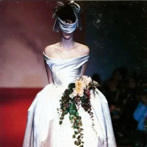
Her Autumn/Winter 1997-98 collection goes in a completely different direction. Inspired by the Dynasties exhibition of Tudor and Jacobean portraits at London's Tate Gallery, the looks are much more structured and bold feeling. Instead of light, flowy dresses, Westwood built strong shapes with boned bodices, full skirts, and darker colors pulled from Elizabethan fashion. Where the spring collection felt airy and loose, this one felt solid and in control. The whole thing comes across as serious and strong, and it is a good reminder that Westwood has always taken history seriously, even when she is having fun with it.
Looking at these two collections together shows just how much range Westwood had. She could make something soft and romantic just as well as something dramatic and bold. In 1997 alone she showed both sides, proving she was never stuck in one lane. That ability to keep changing while staying true to who she is makes her one of the most interesting designers to study